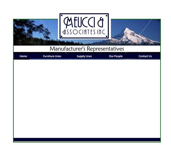
One. Photo at the top. Thinking Mt. Rainier and/or Mt. Hood. Can go either all nature or include a cityscape. (This is Rainier & Seattle.) All images and graphics contained within the "frame" on this one [this will be more clear when you look at the next one].
You also may notice a new logo... ;]
I used your same type face -- just played with it a bit... you'll see a few more
examples of me messing about with it, too.
The green outline -- in one option [we'll call it the 'float' option] would actually be there -- and then the space around the edges could be white or a really pale other color of our choice. I got this idea from one of the sites you showed me: Buddy Brown . The width on all pages remains the same, then the page is just as long as the content needs it to be.
The non-float option -- no green outline, and the site would snug up to the left side of the screen. [Edmonds Bookshop site -- band at the top, left hand nav, then smaller band at the bottom - just to tie it all together.] The wider and bigger that computer screens get, the more the float option starts to make sense...
[These images are all smaller than they will be real life, to make it a bit more manageable.]
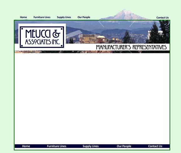
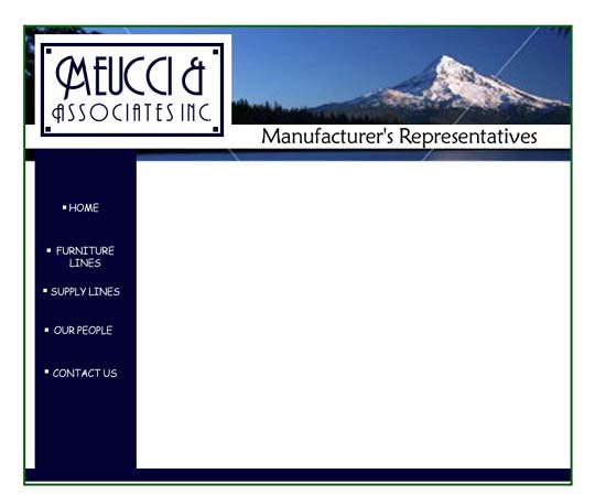
Two. something really fun that the float option allows us to play with [at least for us graphic geeks!] -- having part of the image "break" boundaries. [This photo is Mt. Hood and Portland.] Allows some of the navigation to also be outside the boundaries. And then redundant nav at the bottom, once the content gets onto the page scrolling will be necessary on most pages.
Again -- background color outside the frame can be white or a color.
Different font option on re-worked logo.
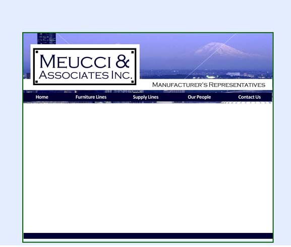
Three. ok. logo and photo both breaking the frame. Navigation back inside. [would be needed on the bottom as well.]
Another font option for the logo... [yes, I was having fun!]
The colors that I'm using here can be adjusted -- the blue and green go very well with the photos. The logo can be black or dark blue [or anything, really.] I'm thinking if we go with a color on the outside -- more subtle than this one turned out looking.
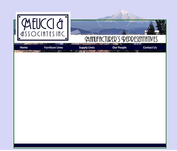
Four. Logo in the middle breaking the frame, with the photo completely within the frame. [photo is Mt. Hood & nature.]
Again -- navigation on top, and would be on the bottom.
Five. Logo and photo all within frame. Navigation on a left bar. This could float, but also would work if you wanted the site pages to be snugged left. [all the options would work snugged left -- it just visually works better if it appears that something is 'holding' it to the left -- on the Bookshop web site, we have top nav, but a left color graphic block containing other info to 'ground' the page to the left. So we could totally do that, too.]
ok -- a few things to thing about... and now here comes more: to the graphical options!
or to the recap page.