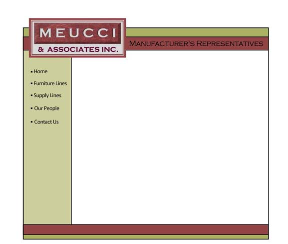
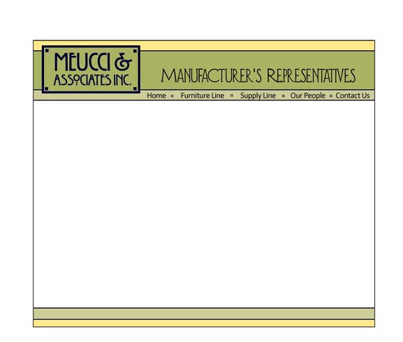
One. A logo you recognize! Bringing in colors that go with it. Navigation on the left. This could float or be snugged left. Room on one of the bottom bars for bottom nav links. [The font for the nav links I haven't gotten serious about -- I figure once you choose a direction and what font(s) the logo and tag line will be in, we can find a font or two for navigation and body text that works nicely.]
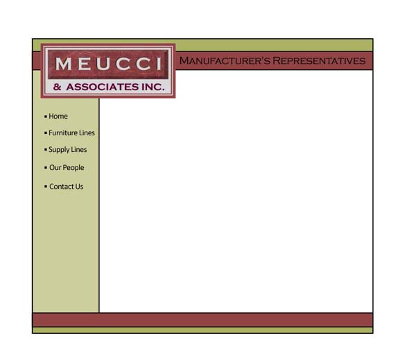
Two. Just moved the logo completely into the frame.
Again -- if we float, the background color outside the frame can be white or a color.
Three. New logo. In the middle breaking the frame. [Original logo can also be in the middle, of course.] Different colors on this one.
Again, the colors that I'm using here can be adjusted/tweaked -- these are nicely 'arts & crafts-y' to go with the logo font...
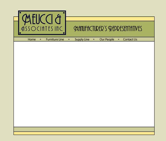
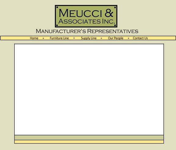
Four. Logo still breaking the frame, but on the left. Color around the floating frame is a grayed version of the lighter green -- I think even lighter would be better...
Navigation on top, and would be on the bottom.
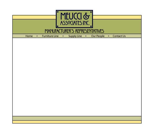
Five. Logo and tag line all within frame. Navigation on the top, and would be on the bottom.
Six. extreme floating. The content would all be within the white space [nav at the bottom, too.] The top nav bar would go across the entire screen with the links centered.
[Hmmmm. not liking this one as much as some of the rest...]
ok -- now, hopefully plenty of things to ponder. Here is a recap/summary page to assist a bit with that. And if you want to go and look at photo options again.